
My Work
01
Brand Design - Psychologist /BR
This is a project filled with lightness, optimistically inviting people to embrace the pursuit of mental health as envisioned by the professional Fabrícia as “a continuous process of transformation leading to freedom”. The highlight of the identity lies in its graphics, which express this journey through continuous lines that take the shape of a mind blossoming and expanding, eventually transforming into a butterfly on its path to freedom.
I developed:


02
Brand and Space Design - Airbnbs in Coastal City /BR
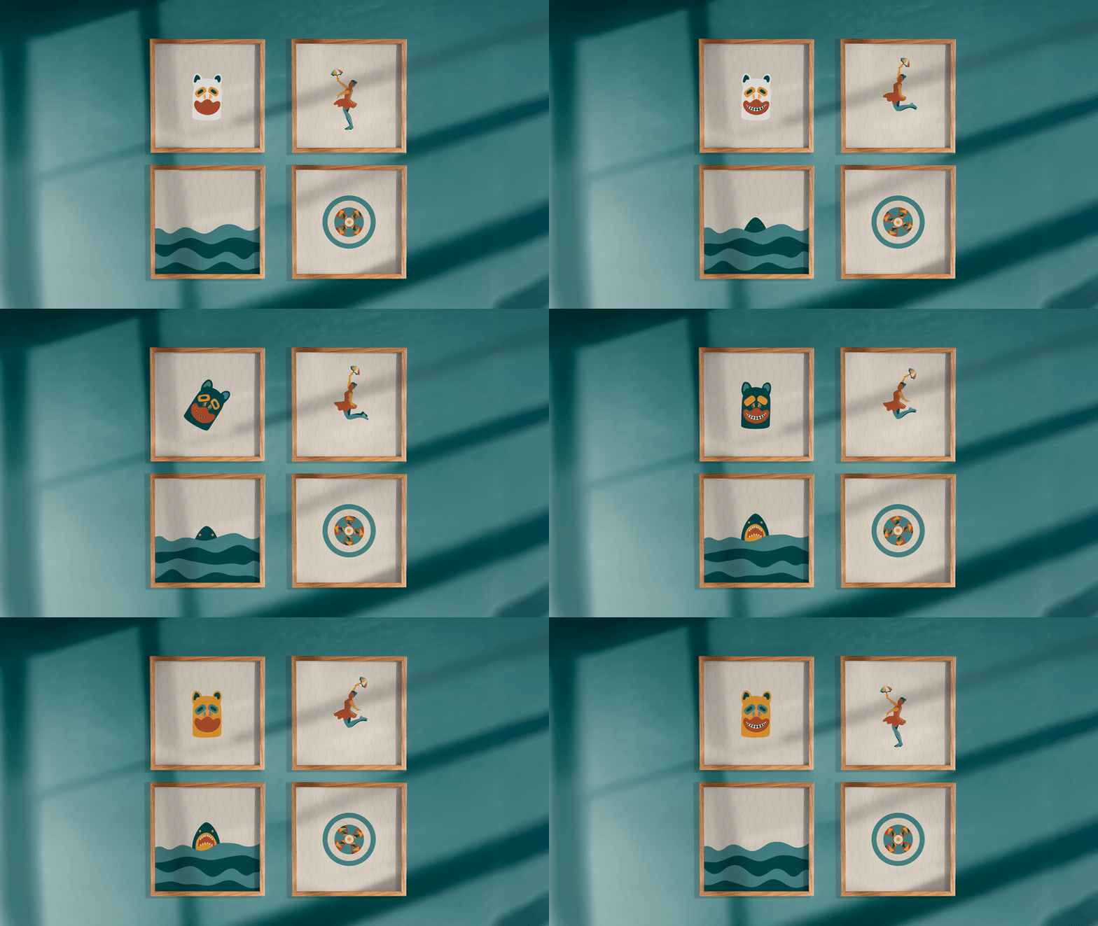
Recife Stay Airbnbs are located in the vibrant coastal city of Recife, Brazil. Its brand identity is inspired by cultural symbols that converge in the flats’ iconic balcony view: the sun, the sea, and the hammock, the last a must in every local home. The space branding blends the coziness of a home like stay and the chic beach aesthetic that matches well its privileged location in the city. Finally, the brand illustrations, featured on souvenirs, celebrate elements of local culture such as regional cuisine, Carnival characters, and natural beauty, evoking fond memories of each guest’s stay.
I developed:


03
Brand Design - Kotonowa (Japanese Learning) /JP
Kotonowa is a Japanese brand that connects people worldwide through language and culture. Rooted in the concept of Wa (harmony within society and nature), the identity blends circles, an element deeply representative of Japan, with seasonal colors and nature-inspired motifs to express connection, joy, and continuity. By reinterpreting traditional Japanese patterns, as Wagara and Marumon, in a contemporary visual system, the design conveys an authentic and welcoming learning experience.
I developed:


04
Brand Design - Sunglasses
Blu Solare (meaning “Sunny Blue”) is a women’s sunglasses brand. Modern, bold, and minimalist, the brand embraces all seasons, recognizing that sunglasses are both protective and fashion accessories. This brought the challenge of featuring the sunlight as a key element in the branding without conveying heat, thus avoiding limiting the brand to just the summer season. For the logo design, I chose lowercase letters and rounded shapes to convey lightness and modernity, complemented by straight edges that provide a sophisticated contrast, reflecting the essence of the brand.
I developed:


05
Layout & Design System - Satisfactory Board Game /DK
At MOOD Publishing, I collaborated with game designers to iterate on game components such as cards, tokens, player boards and maps, simplifying complex gameplay through more intuitive layouts and iconography while helping to shape a cohesive visual identity for the board game adaptation.
For the marketing campaign, I developed a visual design system and mobile first compositions to showcase game components that guided the team through creating a consistent and engaging promotional scroller, the campaign's main sales asset.
I developed:


06
Brand Design - Consultancy and Leadership
IVAA is a company dedicated to promoting leadership, with a particular focus on empowering women in key positions, creating a positive and equitable impact within organizations. Its symbol, inspired by a Nordic element, embodies the belief that "where there’s a will, there’s a way," reinforcing its mission to guide professionals in advancing their careers with purpose.
I developed:


07
“Reasons to Go” is a travel blog, and the challenge in developing its identity—aside from the lengthy
name—was to create brand assets versatile enough to match the diverse photos and videos from various destinations without competing with them, all while unifying the visual content to make it recognizable under the name “Razões Pra Ir.”
I developed:
Brand Design - Travel blog


08
Brand Design - Psychology Institute
IPEC (Institute of Psychology, Education, and Career) focuses on supporting women in reaching their full potential. The logo design emphasizes connection and the main field of the institute—psychology—while conveying a friendly, welcoming feel through lowercase letters and rounded edges. The challenge was to develop a single symbol that represents the individual strengths of each woman, highlights the value of community support offered by IPEC, and reflects growth and renewal.
I developed:


09
Package Design - Perfume Bottle
Packaging design developed for the new fragrances of AVON Aquavibes (cologne).
I developed:


10
Brand Design - Consultancy
De Duas, meaning “By Two” is a consultancy company
leaded by two woman who aimed to launch their brand
as technical, innovative and impactating.


